Stacks
vocabulary learning app
INTRODUCTION
PROJECT OVERVIEW
Stacks is a vocabulary learning app, designed to keep users on task and organized. The app is also meant for quick study sessions, so the app was designed with a very simple and efficient approach.
OBJECTIVE
Design an app that allows users to study vocabulary in an efficient manner.
DELIVERABLES
User account creation
A way for users to upload content (terms and definitions)
A way for user content to be organized in a nested manner
Means of reviewing the user’s uploaded content
THE DISCOVERY
COMPETITOR ANALYSIS
The apps I chose to analyze were Quizlet, Gambit, and Cram. I surprisingly found that these three competitors were vastly different from each other.
With Quizlet being the most credible, I primarily focused on this app. Aside from Quizlet’s longevity and credibility, I soon realized that, because of the very minimalistic and clean designs, it made sense why users chose this app over the others. The ads are even placed in strategic, unannoying places. Quizlet really sets the bar when it comes to clean designs, efficient studying, and the overall caring of their users.
Taking a look at the other competitors, Gambit was actually too minimalistic. It was so minimal that I didn’t know what to do upon initial startup. On the other hand, Cram was a mess of an app. There was a lot going on, and there was a lot of unnecessary information.
As a result of the competitor analyses, it appeared as if users wanted an app where the interface is very clean and minimal, but not too minimal. It was also pretty evident that high levels of organization and efficiency are key.
USER INTERVIEWS
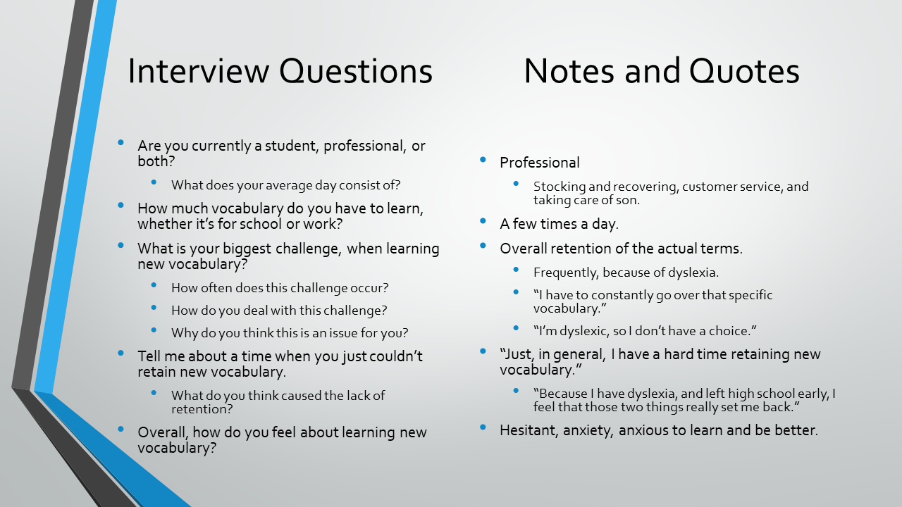
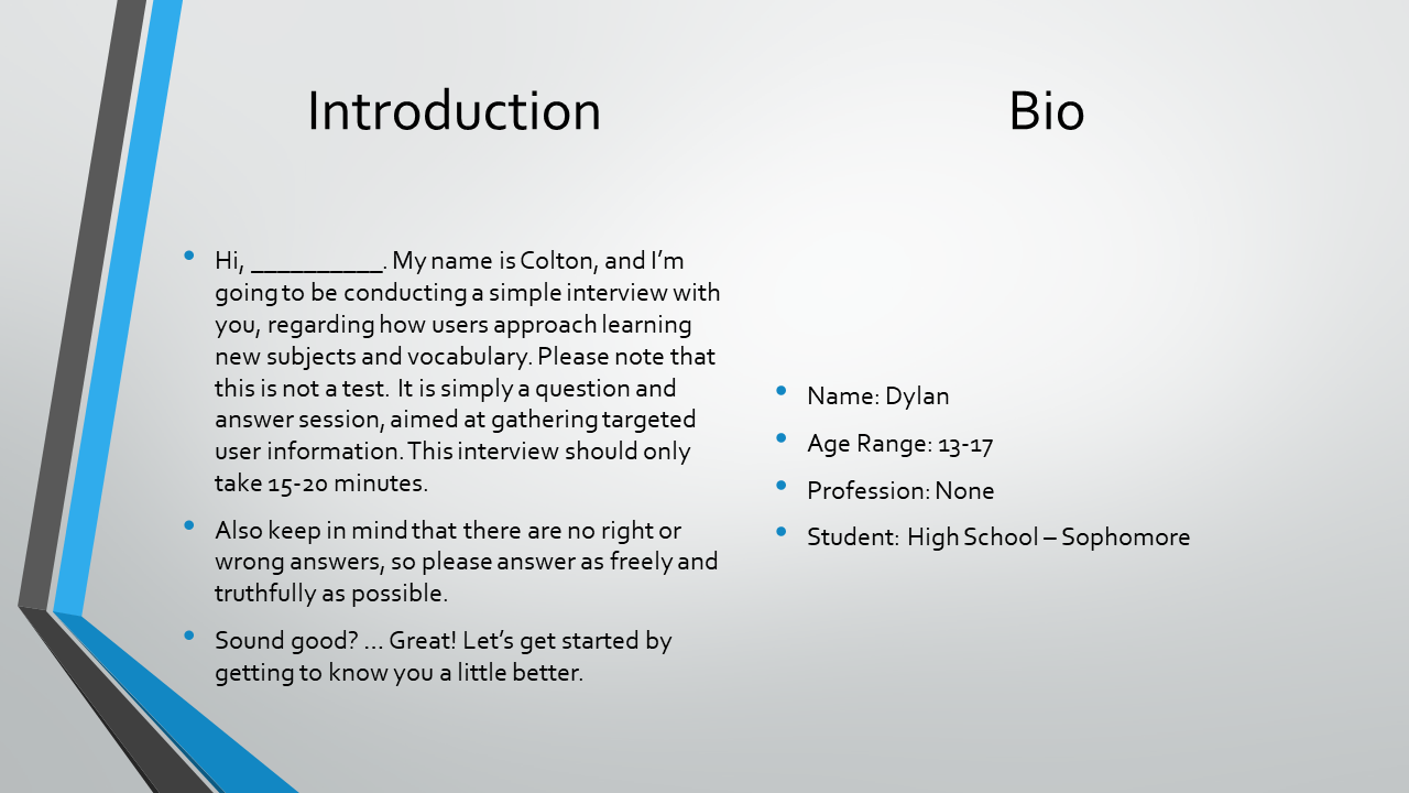
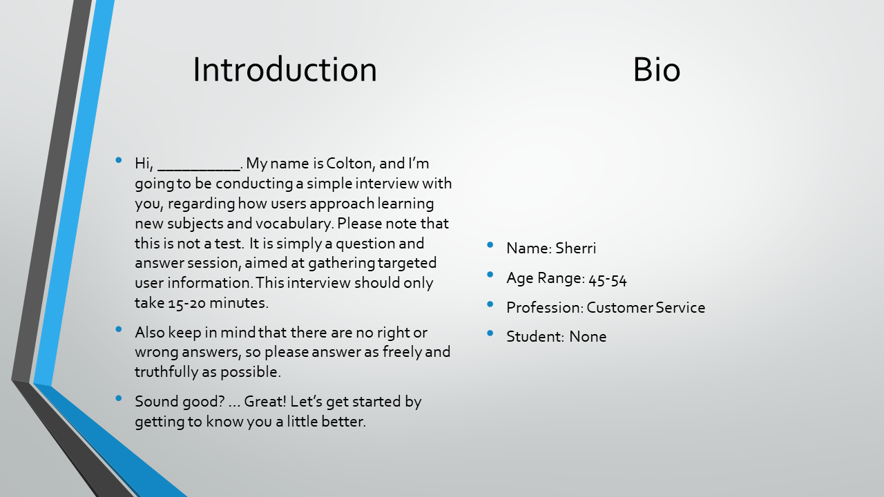
Using the information gathered from the competitor analysis, I wrote an interview script that primary focused on user analytics, how much vocabulary users need to retain on a given basis, and what their biggest retention challenges were. Coming from my recent experiences in college and high school, the results of the user interviews were fairly predictable. All of the in-school interviewees (users who were currently enrolled in college or high school) were expected to learn anywhere between a moderate and high level of vocabulary, as all of the professional interviewees (users who were currently working a profession) found themselves learning a very minimal amount of vocabulary, or none at all.
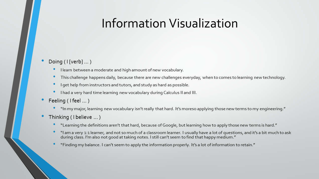
With that, I started to focus primarily on my in-school interviewees. In general, the biggest retention challenges were learning the definitions before the terms, spelling the terms, and knowing how to apply the new vocabulary to whatever topic it coincided with. Taking these three, vastly different challenges into account, I told myself that these different challenges were to specific, and that I had to take a step back, and be a bit more vague in describing the user problems.
After taking a step back, I came to realize that, out of all the user challenges, they all summed up into one, common scenario - how information is presented to users. Information needs to be presented in a clean, efficient, and distraction-free manner, because if the users don’t have ease learning the new vocabulary, they will, in general, have retention and application issues.


USER PERSONA
Jeff here is my primary persona. He's a full-time accountant, who also attends night classes, working towards a bachelor’s degree in business. Jeff is a perfectionist and a well-structured and organized guy. For Jeff to succeed in life, because he’s such a busy guy, he needs a quick way to study, high levels of organization, distraction-free environments, and to propose his best work.
PROBLEM STATEMENTUsers need a way to study quickly, stay very organized, and have a distraction-free zone.
HYPOTHESIS STATEMENTWith Jeff in mind, I believed that by designing a minimalistic, clean, and ease of access design, I would achieve efficient usage of the app. I also believed that by implementing nested organization (decks and folders within folders), I would achieve a high level of organization.
THE FRAMEWORK
INFORMATION ARCHITECTURE
Since studying should be an efficient task, I wanted to keep the sitemap very minimal. Because studying should also be an organized task, I also wanted to add nested organization to Stacks. With these two factors in mind, the sitemap came out to be what is show below.
SKETCHES, WIREFRAMES & PROTOTYPE
I took a very simple and clean approach, because I know that users want to get in, get their studying done, then get out. I first started designing the entire app with some low-fidelity sketches. I then created the first, clickable prototype, using the low-fidelity sketches, with Prott.
THE REFINEMENT
USABILITY TESTING
I primarily wanted to test the direct tasks, which were creating a user account, creating and viewing a deck, and creating and viewing a folder. The scope of the usability tests was to meet with five users anywhere, whenever they had free time, have 10-15 minute long sessions, and have them all use the same device, so the results were unbiased and "in the wild" as possible.
Overall, the first round of usability tests were good. However, one of the tasks threw a massive curveball to most of the users. Three out of five users didn’t even make it to the deck and folder selection page (the page where users select the decks and folders to place in the folder in which they are creating). My theory, as to why those three users didn’t make it to the deck selection page, is that the folder creation task is a two-page process, as the deck creation task is just a one-page process.
After talking with the users, after the tests, I actually found out that my theory was not true. All three of the users said that the “Click the + button to add decks.” sentence was the thing that threw them all off. They said they didn’t even read it, because it wasn’t the first thing presented to them on that given page (naming the folder is presented to the users first).
ITERATIONS
First of all, I turned my low-fidelity prototype into a mid-fidelity prototype, with Prott, coinciding with the user feedback. With another round of usability tests, everything seemed to be a lot better. After that, I designed a high-fidelity prototype, with Adobe XD, tested again, and all was still good.
After some time, the iPhone X released and I took my minor in UI Design. As you might imagine, I wanted to revamp the UI design of Stacks. With that, I redesigned the entire application for the iPhone X and with an updated UI. Stacks was originally designed for the Galaxy S7.
I showed the updated version of Stacks to the original group of usability testers. They all loved it and said it was way better than the first, final version. With that, Stacks was complete.
CONCLUSION
PROJECT WINDUP
This project was intended to show my overall, UX design process. There was no further development upon the second round of usability tests, as this app is merely a conceptual project. Stacks took about three weeks to design (with the redesign included).
FUTURE IDEAS
Add social media integration, upon user registration.
Allow users to learn from other users, by making user created content public.
Add a native, notification system that reminds users when to study.
WHAT I'VE LEARNED
Design assumptions are not always true.
Humble your opinions, because analytics speak the facts.
Don’t get attached to your initial designs, as they can change dramatically overtime.