GeoSync
scavenger hunting app
INTRODUCTION
PROJECT OVERVIEW
GeoSync is a scavenger hunting app, designed to give users a modern feel to an old pastime. The primary goal for GeoSync was to be a potential competitor, but also have a fun and creative edge.
PROBLEM
With GeoSync being a social gaming experience, users needed a way to scavenger hunt with accuracy and ease. Their time is precious, so we didn’t want our users to work excessively for what they wanted.
OBJECTIVE
Design an app that allows users to enjoy social scavenger hunting through accuracy and ease
DELIVERABLES
Competitor analysis
User interviews
User personas
Problem statement
User journeys
User flows
Information architecture
Wireframes
Prototype
Usability testing
THE DISCOVERY
COMPETITOR ANALYSIS
The apps I chose to analyze were Geocaching and Munzee. Both have credible user bases and they relatively offer the same design approach.
The one thing that really stood out to me is that both competitors have user-created locations. This causes a great amount spam, especially when it comes to game titles.
As a result of the competitor analyses, aside from a clean interface and a ton of locations to hunt for, it appeared that users wanted a user community. Scavenger hunting has always been about having a good time with friends, so it would make sense to offer social media connections, a friends list, and game invites to GeoSync.


USER INTERVIEWS
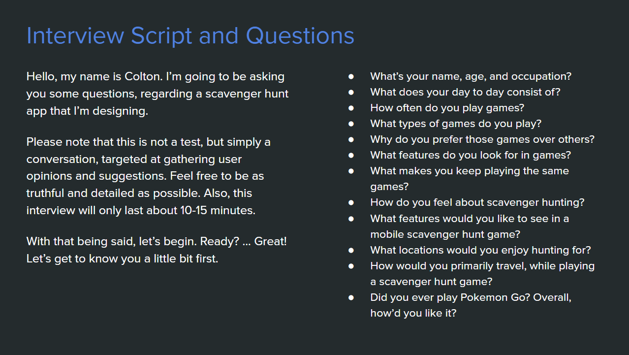
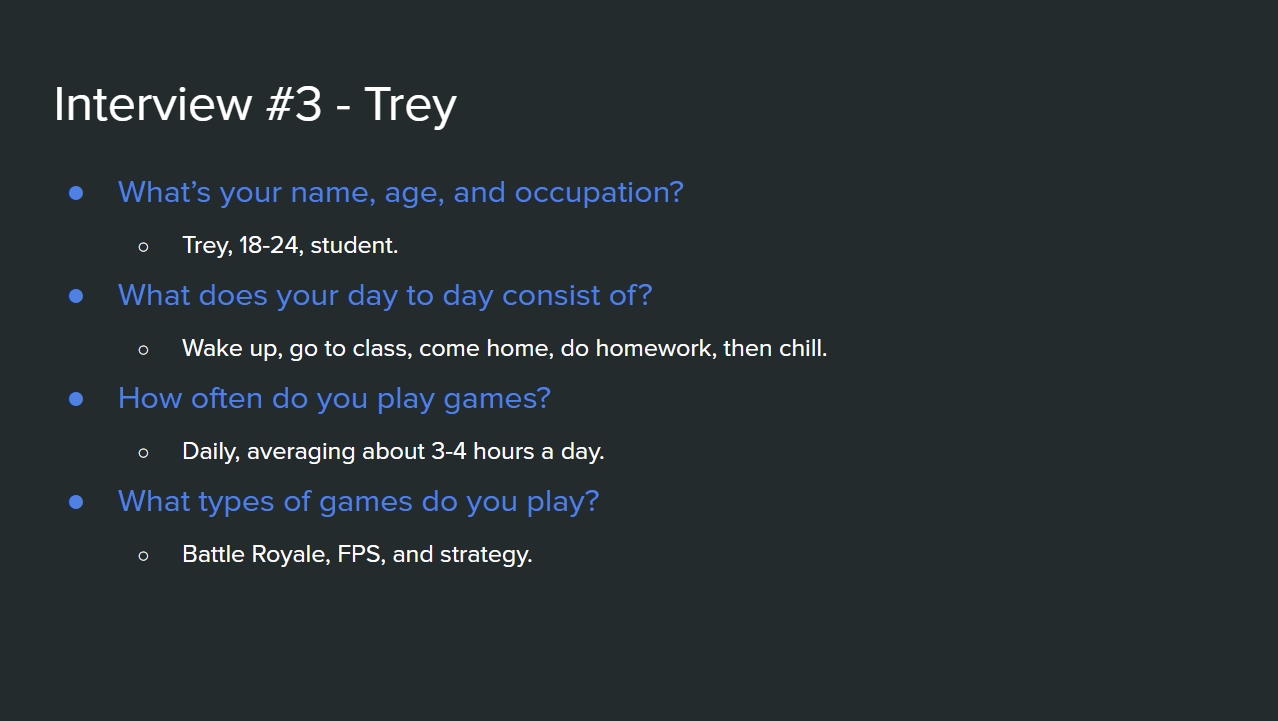
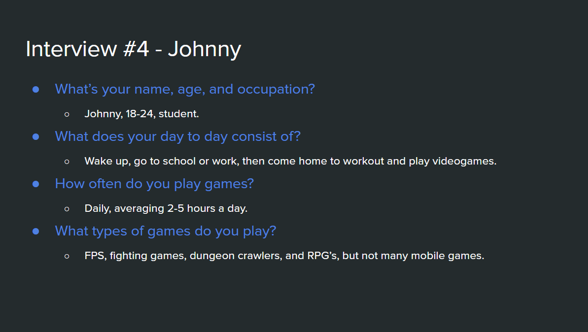
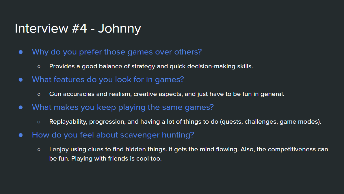
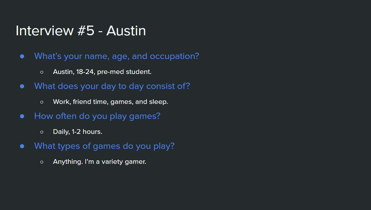
Using the information gathered from the competitor analysis, my interview script focused on how often users play games, how users play games, and what they look for in games. As a result of my interviews, most users play mobile games on a regular basis, looking for game progression, customization, and creativity. It also came out that most users would prefer to hunt for short distance and easy to access locations. On the other hand, there was a small percentage that wanted a challenge (which would consist of long distances and hard to access locations).








USER PERSONAS
With my interviewees in mind, I further summarized the interview answers with some affinity mapping. I then gathered some final insights and formed a problem statement.
PROBLEM STATEMENTOur future users need a way to scavenger hunt with accuracy and ease, because we know their time is precious, and we don’t want our users to work excessively for what they want. We also want the app to be fun and offer means of customization, progression, rewards, creativity, and replayability.


USER JOURNEYS
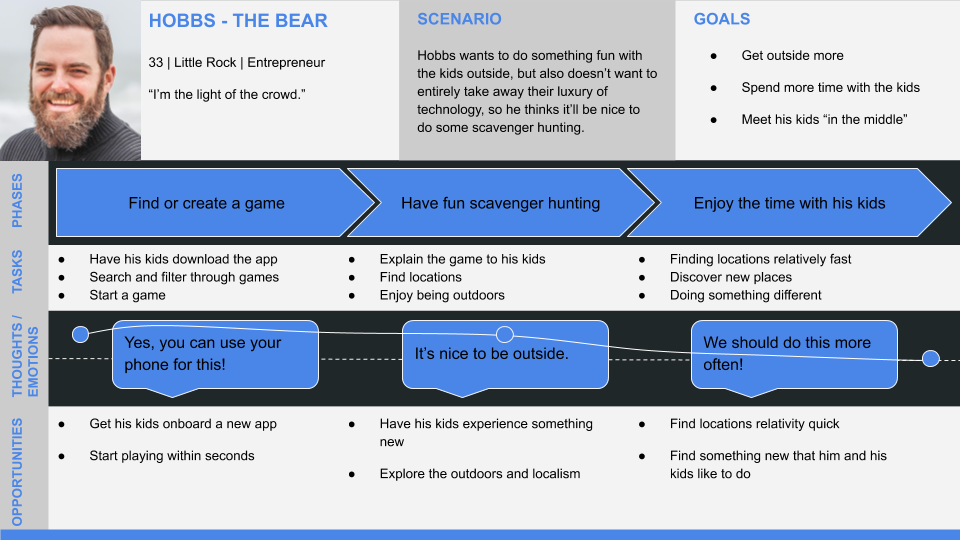
After defining the primary and secondary user personas, I wanted to turn each persona into a more technical outline, primarily to better visualize each persona’s needs and goals.


USER FLOWS
After visualizing the user journeys, it was time to take my technical outlines and turn them into something more useful for the end product. To begin, I wrote down the task flow criteria and analysis. Then, I designed the user flows themselves.


THE FRAMEWORK
INFORMATION ARCHITECTURE
Keeping my user personas in mind, I created the initial sitemap for GeoSync. After taking a final look at it, I realized there was a bit to much going on, so I took back to my interviewees. I had all of them do some card sorting, which would ultimately help narrow down the app’s future navigation.
As a result of the card sorting, I got some really interesting insights and narrowed down GeoSync’s navigation from six pages to four pages: Games, Rewards, Notifications, and Profile.
SKETCHES, WIREFRAMES, & PROTOTYPES
As I usually do, I took a very simple and clean design approach. With that, I jotted down some sketches for my MVP’s, then turned those sketches into mid-fidelity wireframes (using Axure), and created a clickable prototype (using Prott).
THE REFINEMENT
USABILITY TESTING
I wrote a usability test plan, then took my mid-fidelity prototype to six participants. The primary goal of the usability study was testing the app’s initial learnability. I wanted to make sure all tasks and processes were easily understandable for all users, considering GeoSync’s targeted audience is so broad.
Because GeoSync was in a mid-fidelity state, I expected a lot of negative feedback, which I knew would help me a lot in the near future. Overall, GeoSync was in an ok spot. It needed some tweaks, but nothing to major. Because of the usability tests, I learned that the app has great potential, but needs to be a little less bland and basic.


ITERATIONS
Taking my usability test results into play, I updated GeoSync with high-fidelity mockups (using Adobe XD). I also added some more features to make GeoSync feel more sophisticated. With that, I ran another round of usability tests, and all seemed good. GeoSync was complete.
CONCLUSION
PROJECT WINDUP
This project was intended to show my overall, UX design process. There was no further development upon the second round of usability tests, as this app is merely a conceptual project. GeoSync took about three months to design.
FUTURE IDEAS
Add some more robust rewards / incentives to increase replayability
WHAT I'VE LEARNED
Letting go of original design is challenging, but it's necessary to create a better product.
I have learned how to implement accessibility (WCAG) guidelines.
Messing around with color contrasts (with WebAIM) and creating color pallets (with ColorHunt) is a new pastime of mine.